ALLLLLOOOOHHHHHAAAAAAA!!!!
Our Designers really let their creativity run wild on this one!
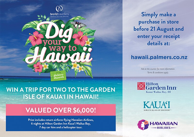
Mix in some Flowers, A bit of colour, A master of all things design and a beautiful picturesque beach escape and you've got a pretty good looking poster!
Hand painted tropical plant imagery was used to elude to the garden isle and keep on brand with the rest of Palmer's Advertising.
Our Designers also made the most of the Tropical Island feel by using bright holiday colors to help entice the customers to enter in the competition and to portray a sense of 'Holiday Mode' and perhaps a little bit of jealousy when you see how enticing it looks to be in Hawaii right about now!! Ticket for two?! YES PLEASE!!!
The posters we designed were in a range of sizes, from cafe table cards to massive A0 posters, These were printed on a waterproof stock so that they would stand being out in the Garden Centre environment.
